Data Visualisation with ggplot2
Communicating your data
2024-06-03
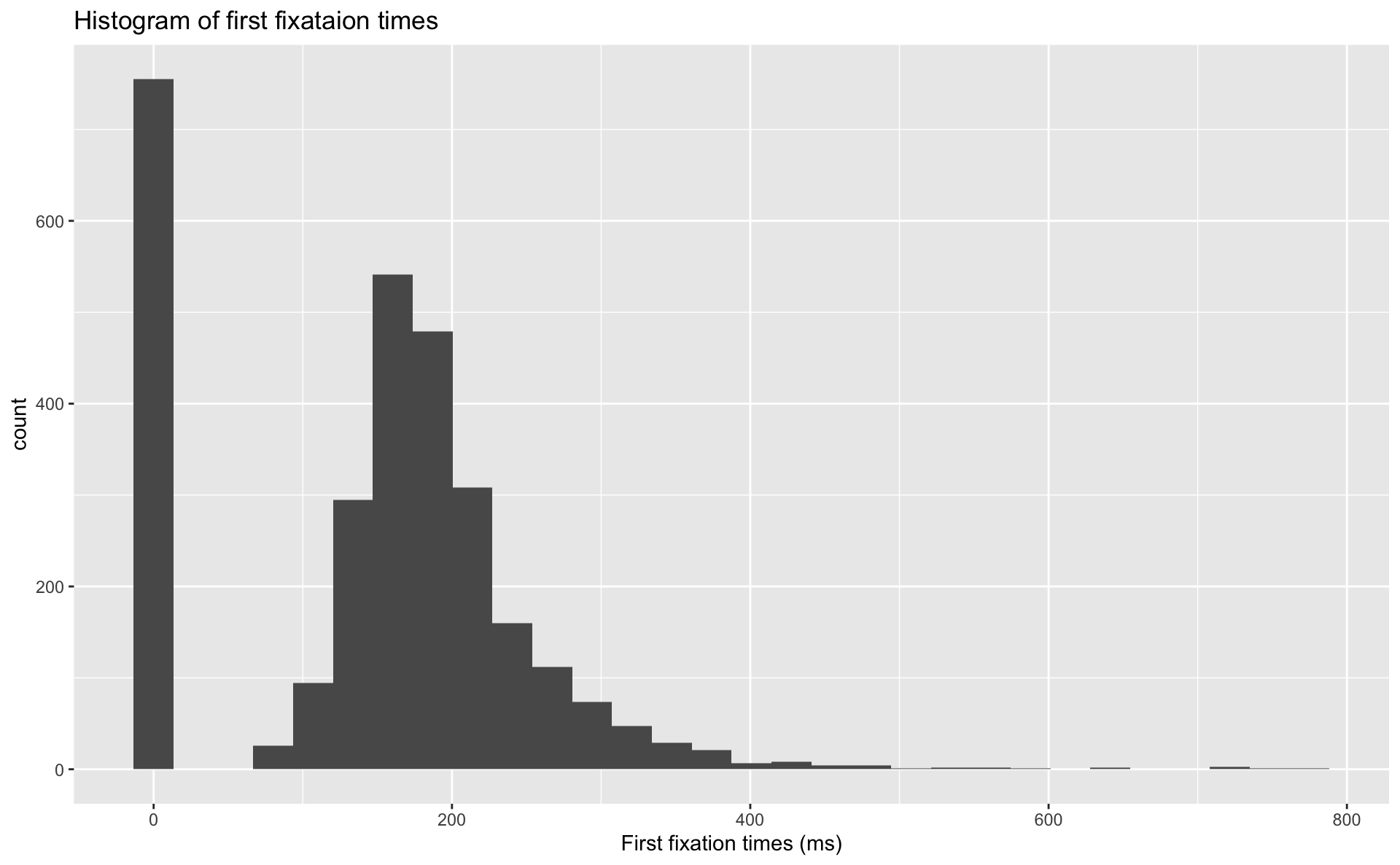
An example: histogram
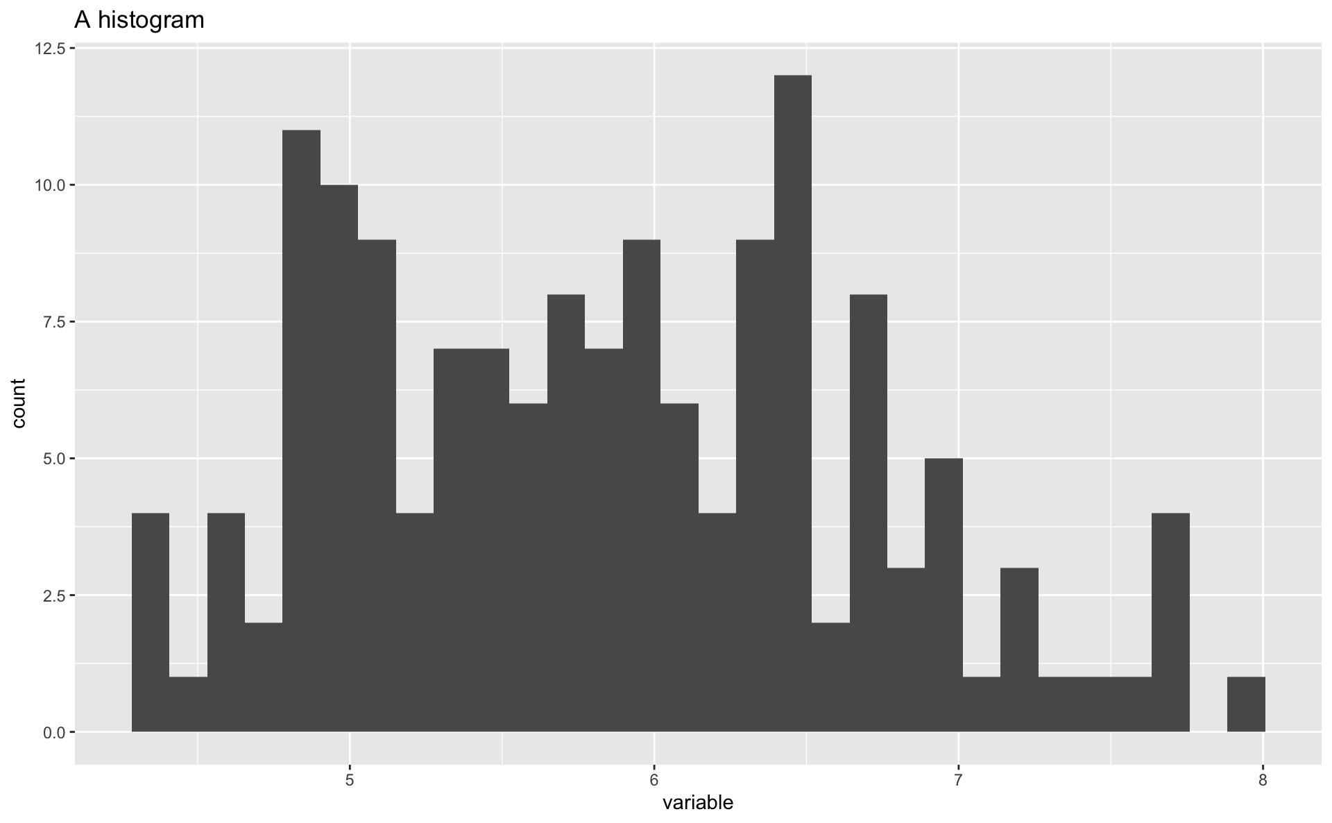
Start layering
Add labels
Add
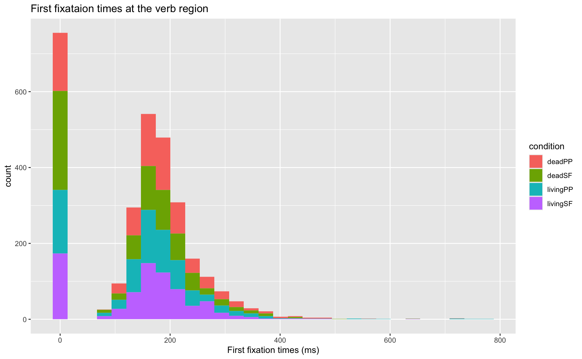
Add condition
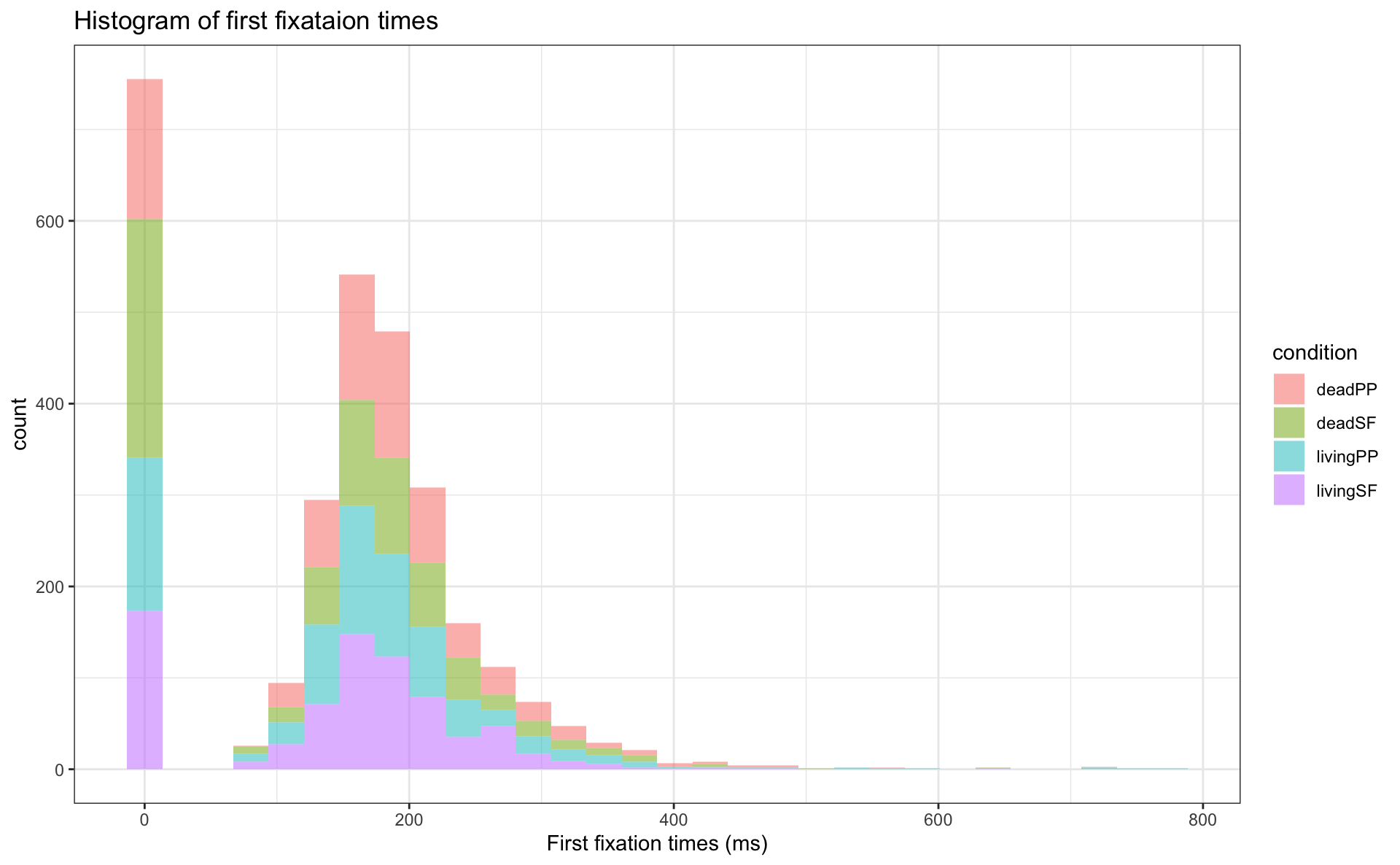
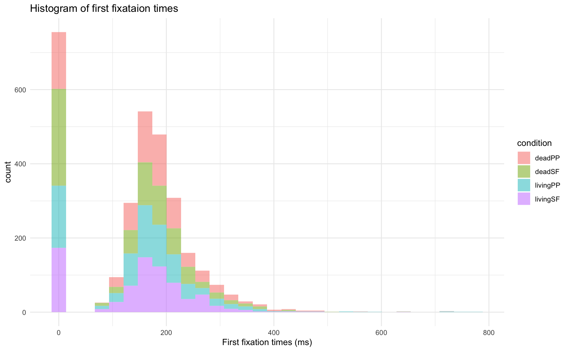
Customisation
- we can add arguments to our geoms
- e.g., transparency:
alpha =takes a value between 0 to 1
- e.g., transparency:
- we can use
theme()to customise font sizes, legend placement, etc. - tehre are also popular preset themes, such as
theme_bw()andtheme_minimal()
Distributions
- show the distribution of observations
- so we can see where the data are clustered
- and eyeball the shape of the distribution
- we already saw the histogram, which shows the number of observations per variable value
- density plots are another useful plot for visualising distributions
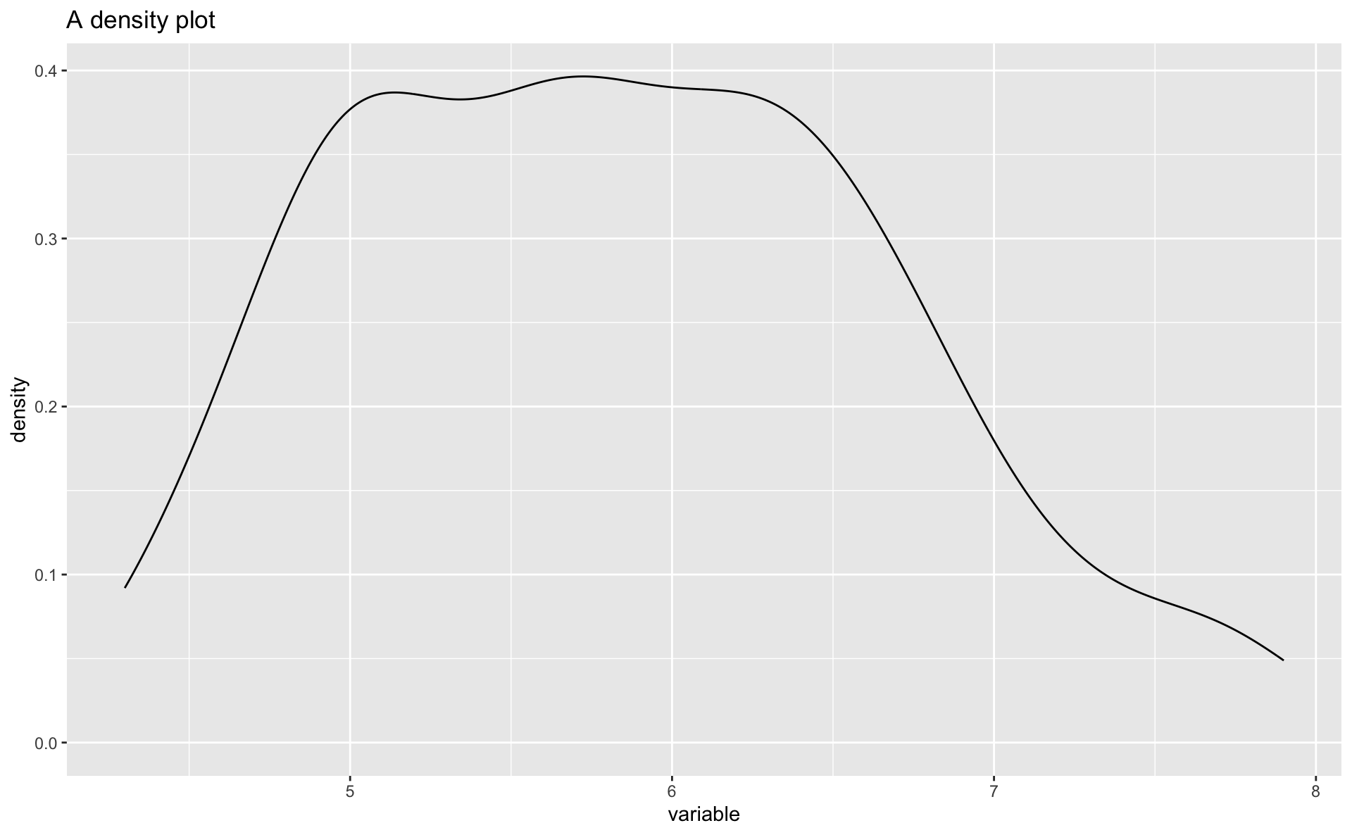
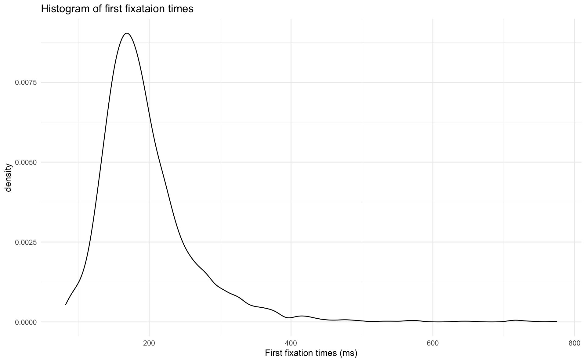
Density plots
- below I just replaced
geom_histogram()withgeom_density()- I also filtered the data to include only values of
ffabove 0
- I also filtered the data to include only values of
- what is plotted along the y-axis? how does this differ from a histogram?
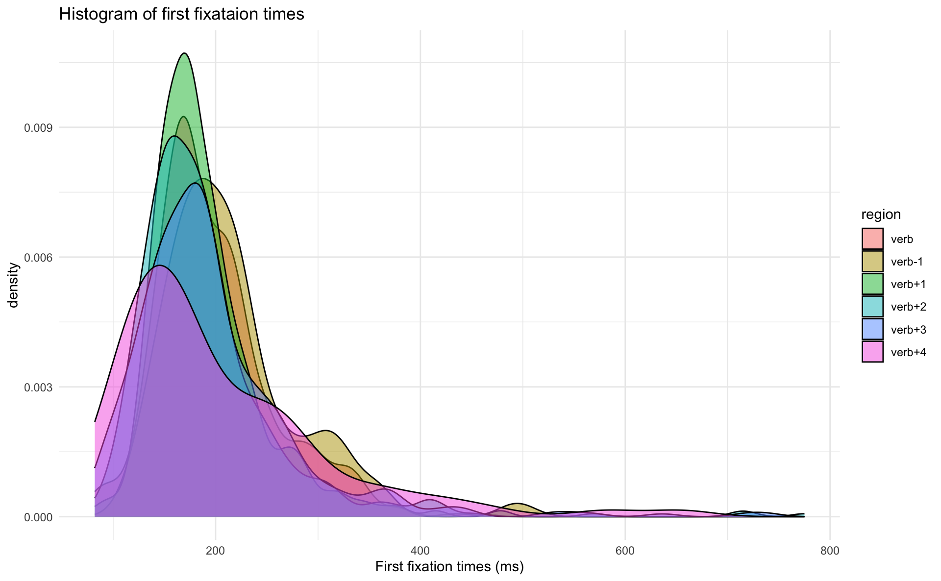
Grouped density plots
- just like with histograms, we can look at the density plots of different subsets of the data with
aes(fill = )- like region
facet_grid()
- there are a lot of overlapping density curves, let’s try to separate them with
facet_grid(x~y)
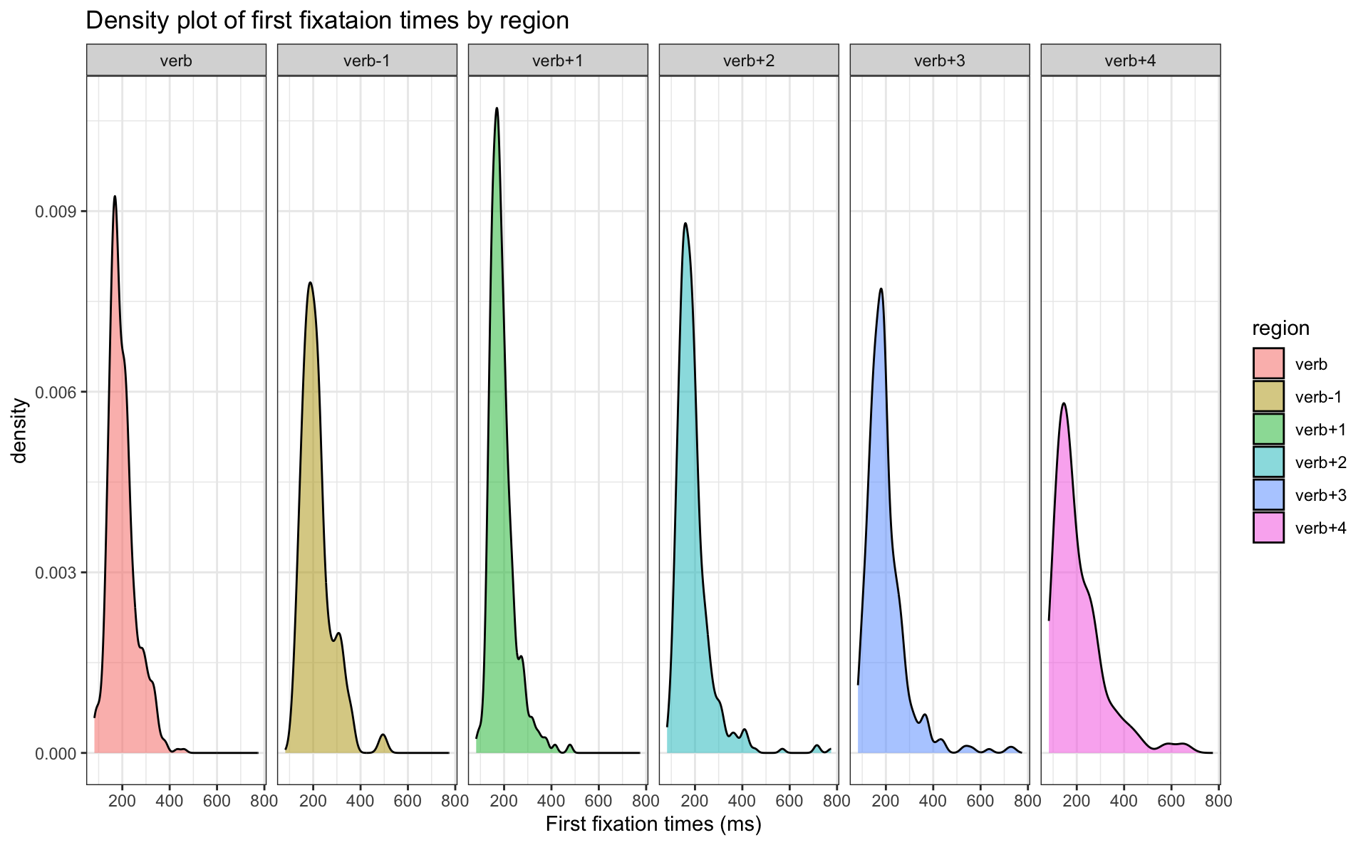
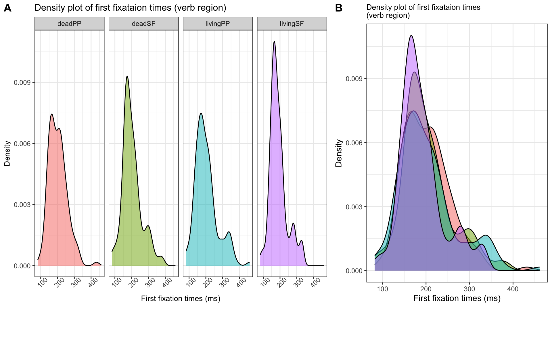
- how would you describe the density plots of the different regions?
Exercise
- create a density plot with the fill colour set to
condition, but:
- subset the data to only include the verb region
- you can decide if you want to use facets or to have the density curves overlayed
- your plot should look something like A or B:
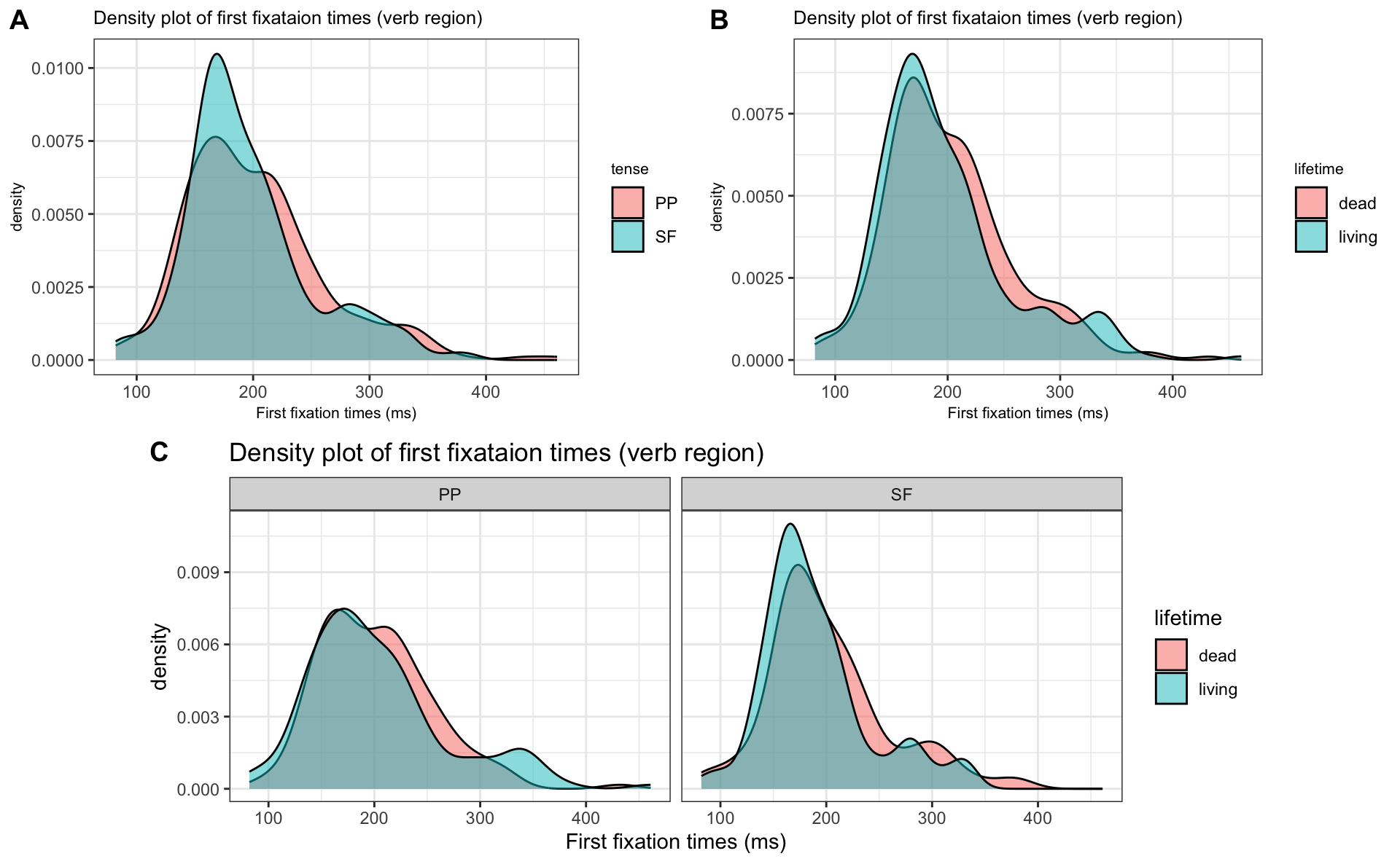
Extra exercise
- Can you produce these plots?
Scatterplots
- histograms and density plots plot a single variable along the x-axis
- in most other plots the dependent (measure) variable is plotted along the y-axis by convention
- scatterplots plot the relationship between two variables
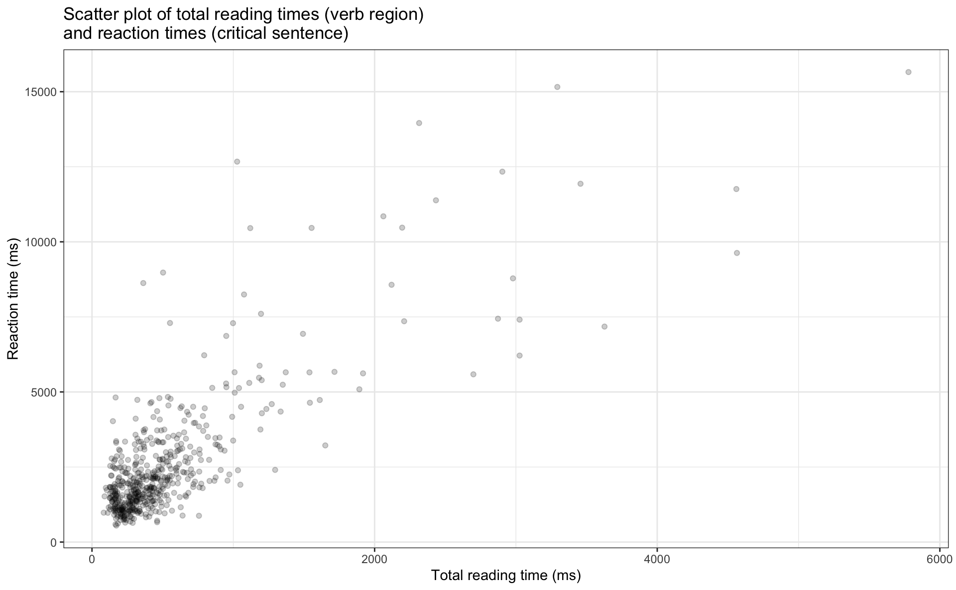
Scatterplots
- the figure below plots total reading times (verb region) to the verb region (x-axis) and reaction times to the critical sentence (y-axis)
- what does each point represent?
- how would you describe the relationship between the two variables?
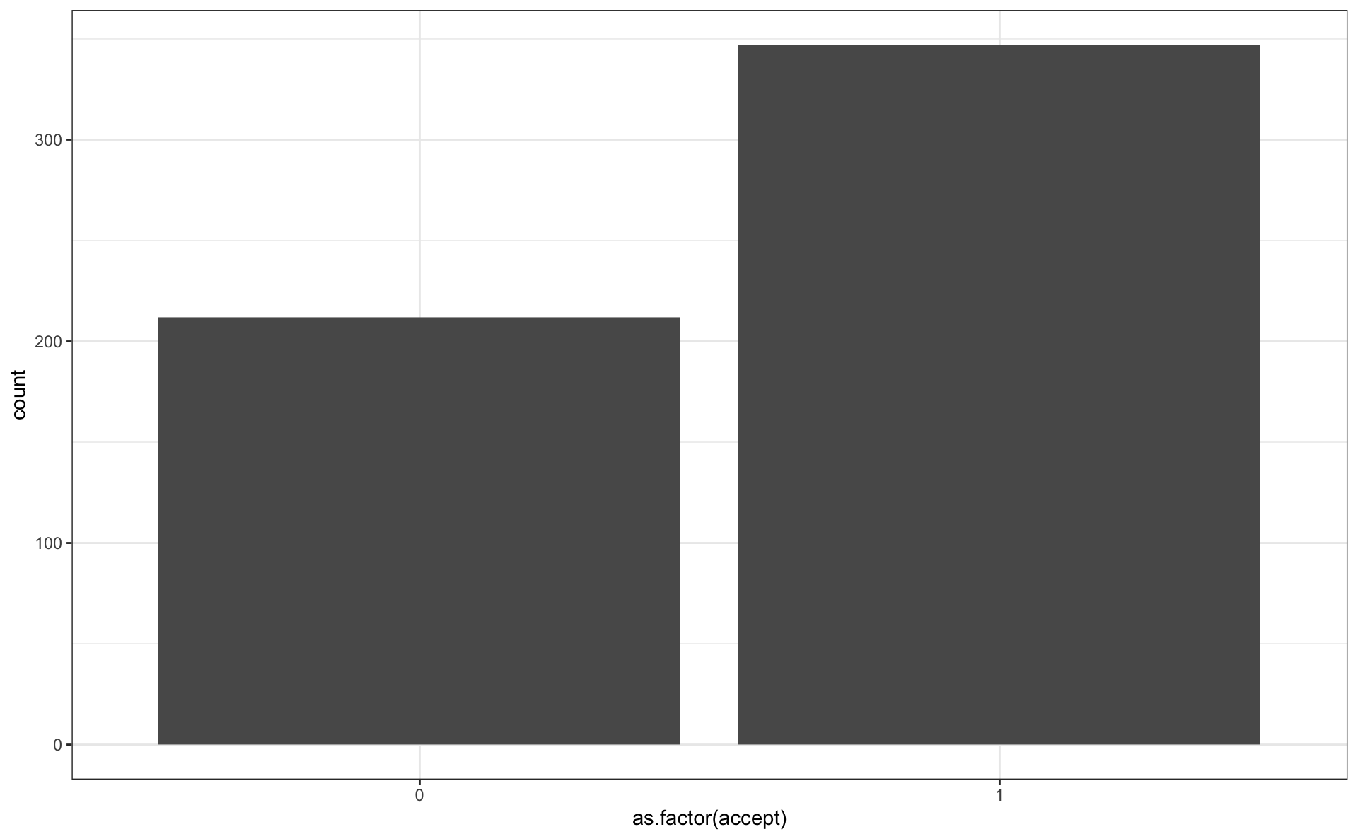
Bar plot
- show the distribution of categorical factor levels
- i.e., the frequency of observations per level
- be sure to read in
acceptas a factor!
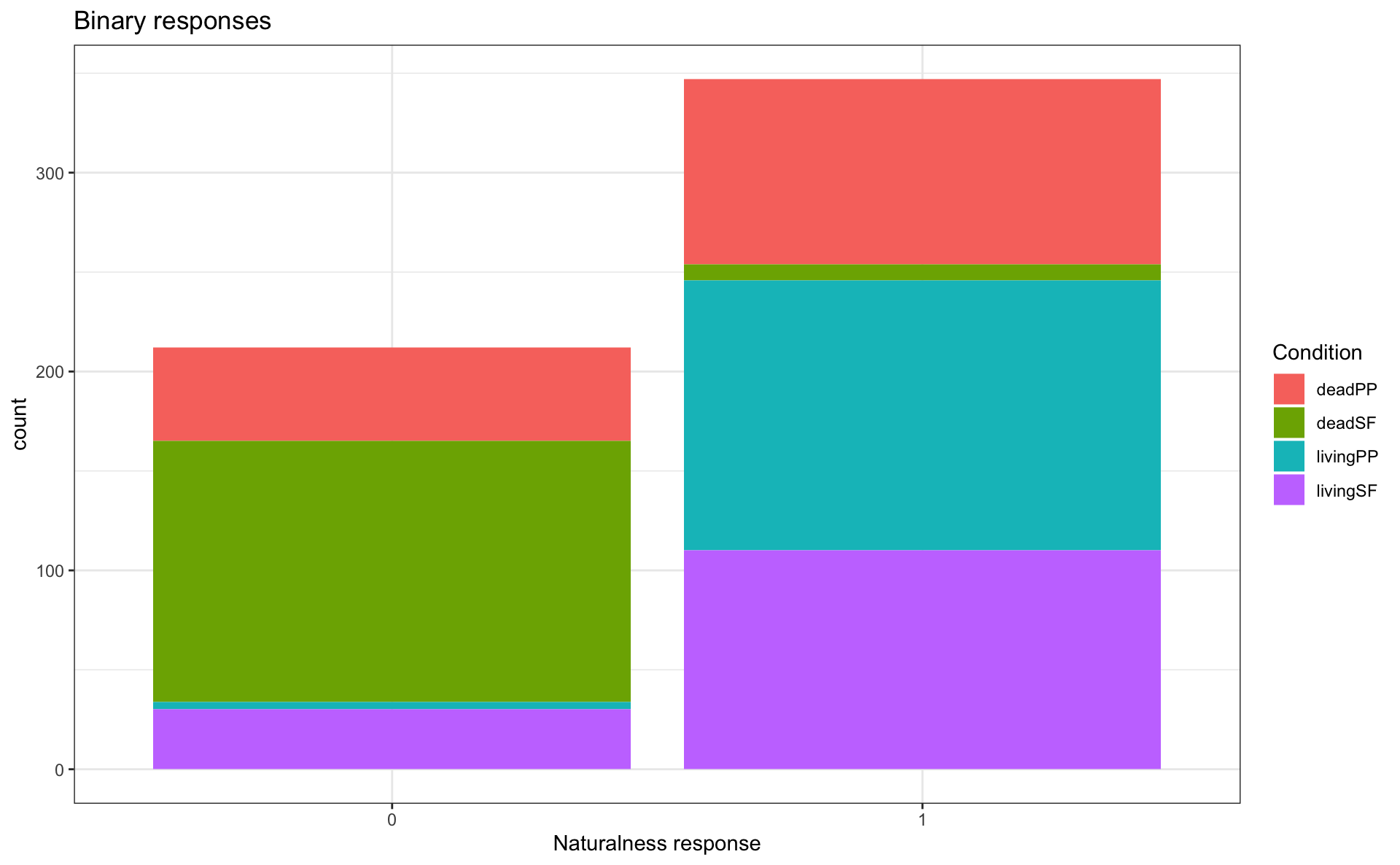
Grouped bar plots
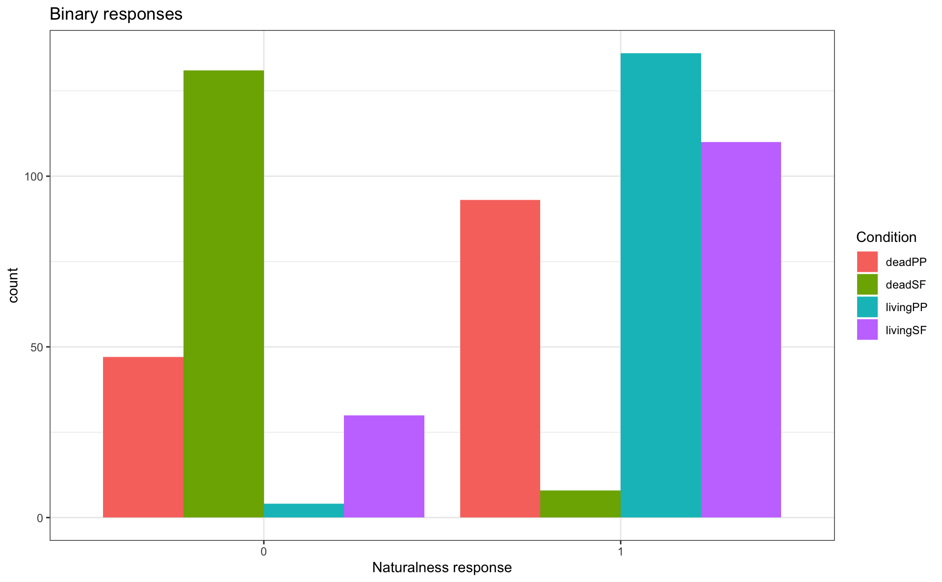
Grouped bar plots
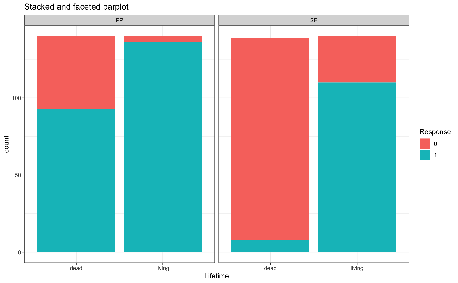
Stacked bar plots
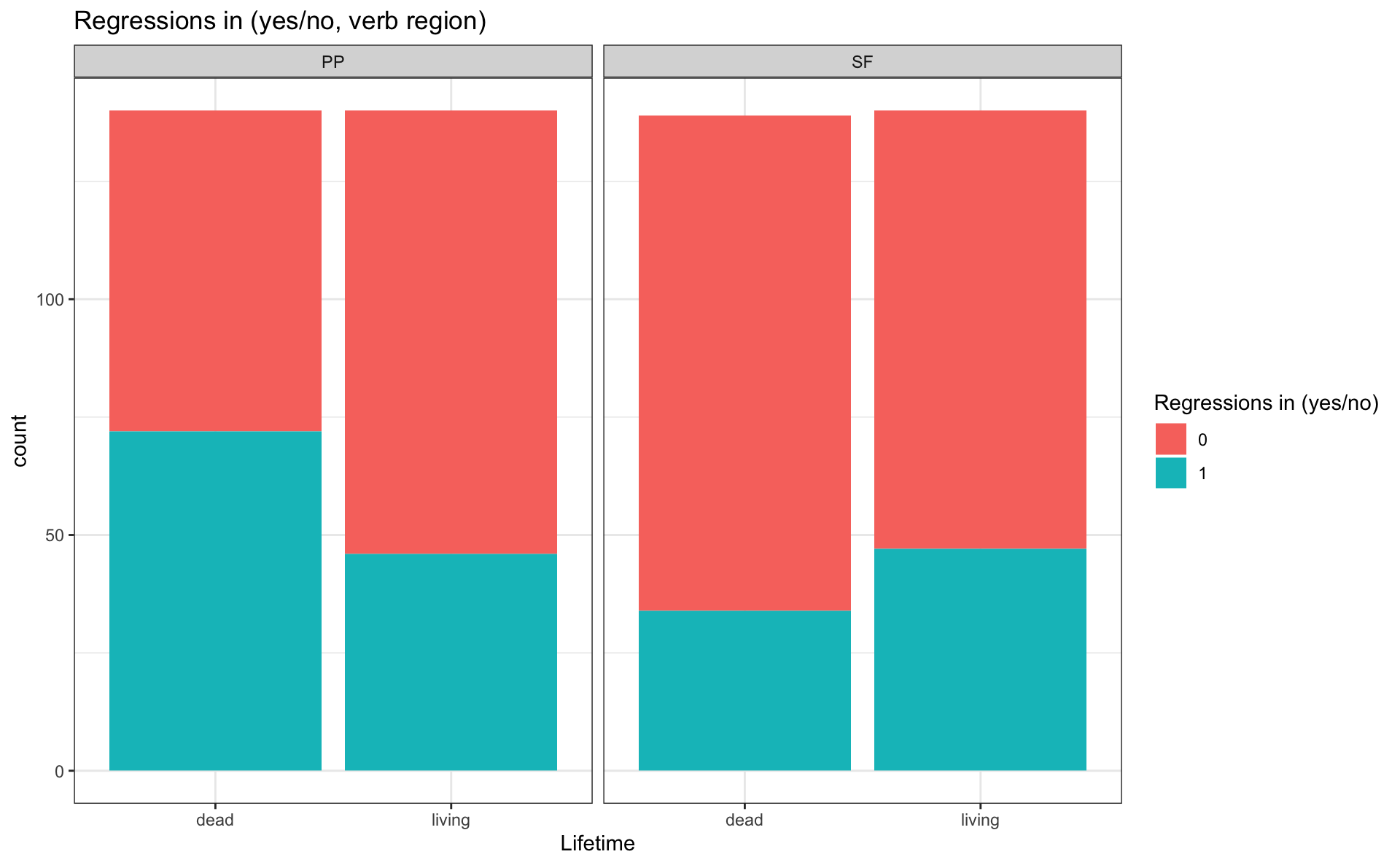
Exercise
- Choose the barplot you like best for binary data
- Reproduce that barplot, but with
reg_inat theverb1region
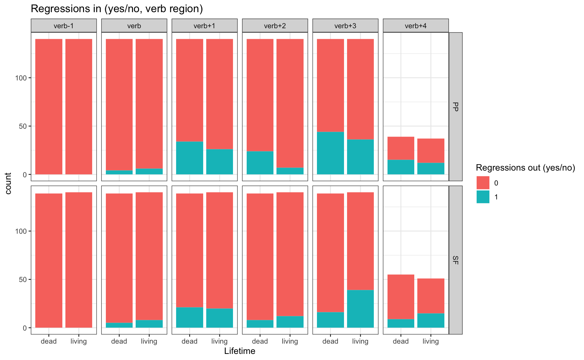
Extra exercise
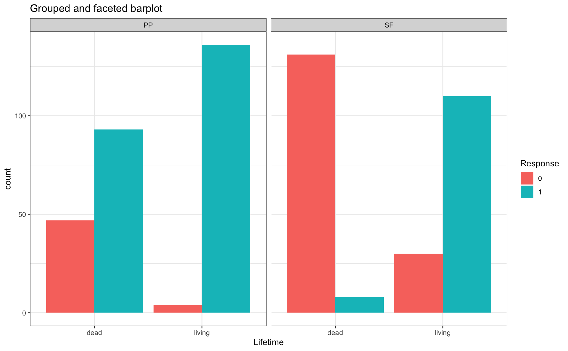
- Create another bar plot, but for
reg_outfor all sentence regions - Use
facet_grid()
- to have facets by region (columns) and by tense (in 2 rows)
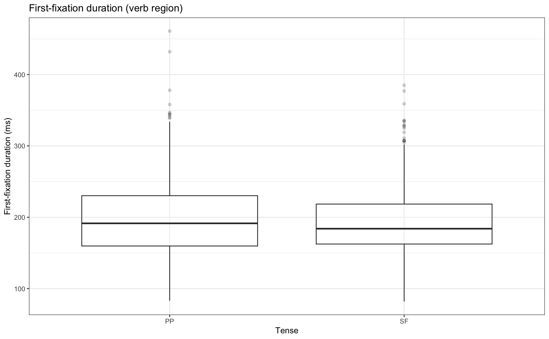
Boxplot explained
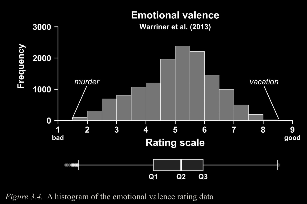
Image source: Winter (2019) (all rights reserved)
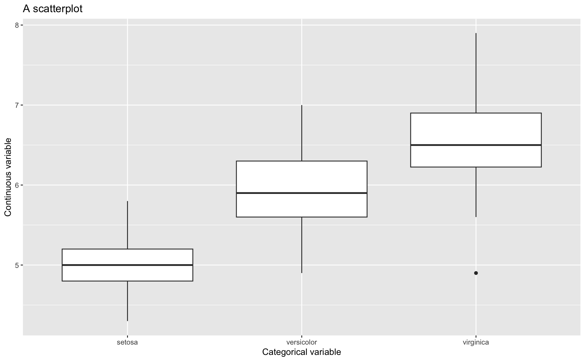
Boxplots
- let’s change our scatterplot to a boxplot
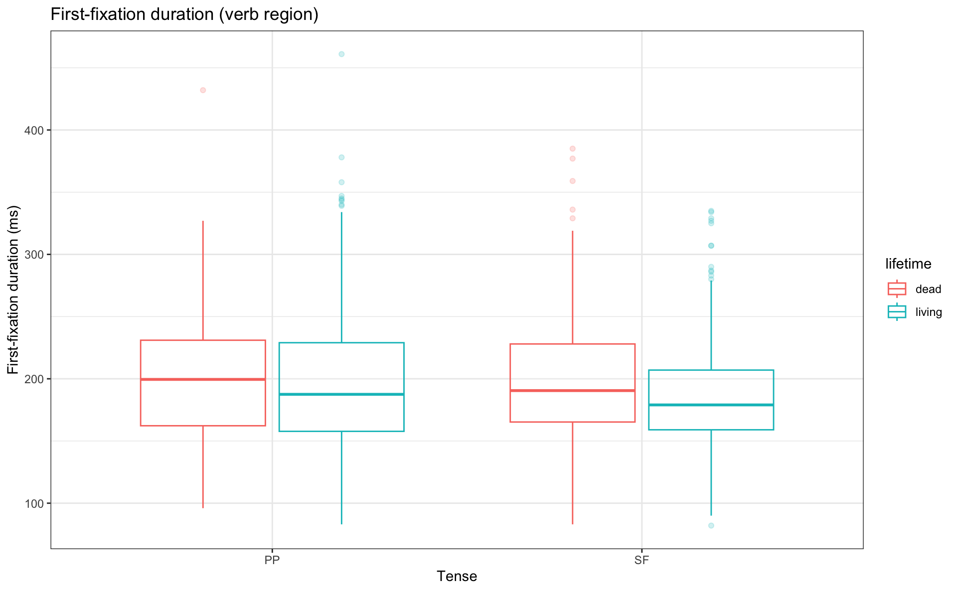
Grouped boxplots
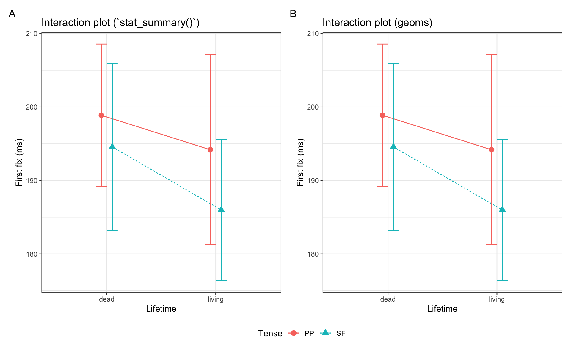
Interaction plots
- common for factorial designs, i.e., comparing categorical predictors
- there are 2 ways of producing them:
- with your data frame and
stat_summary() - or with a summary table and ggplot geoms
geom_point(),geom_errorbar(), andgeom_line()
- with your data frame and
- we’ll need our summary table to plot an interaction plot
| condition | lifetime | tense | N | mean.ff | sd | se | ci | lower.ci | upper.ci |
|---|---|---|---|---|---|---|---|---|---|
| deadPP | dead | PP | 140 | 198.9 | 57.9 | 4.9 | 9.7 | 189.2 | 208.6 |
| deadSF | dead | SF | 139 | 194.6 | 67.9 | 5.8 | 11.4 | 183.2 | 205.9 |
| livingPP | living | PP | 140 | 194.2 | 77.3 | 6.5 | 12.9 | 181.3 | 207.1 |
| livingSF | living | SF | 140 | 186.0 | 57.6 | 4.9 | 9.6 | 176.4 | 195.6 |
Code
library(patchwork)

df_lifetime |>
  filter(region == "verb") |>
  ggplot(aes(x = lifetime, y = ff,
                     shape = tense,
                     group = tense,
                     color = tense)) +
  labs(title="Interaction plot (`stat_summary()`)",
       x = "Lifetime",
       y = "First fix (ms)",
       shape = "Tense", group = "Tense", color = "Tense", linetype = "Tense") +
  stat_summary(fun = "mean", geom = "point", size = 3, position = position_dodge(0.2)) +
  stat_summary(fun = "mean", geom = "line", position = position_dodge(0.2), aes(linetype=tense)) +
  stat_summary(fun.data = "mean_cl_normal", geom = "errorbar", width = .2
               , position = position_dodge(0.2)) +
  theme_bw() +

summary_ff |>
  ggplot(aes(x = lifetime, y = mean.ff,
                     shape = tense,
                     group = tense,
                     color = tense)) +
  labs(title="Interaction plot (geoms)",
       x = "Lifetime",
       y = "First fix (ms)",
       shape = "Tense", group = "Tense", color = "Tense", linetype = "Tense") +
  geom_point(size = 3,
                position = position_dodge(0.2)) +
  geom_line(aes(linetype=tense), position = position_dodge(0.2)) +
  geom_errorbar(aes(ymin = mean.ff - ci,
                    ymax = mean.ff + ci),
                width = .2,
                position = position_dodge(0.2)) +
  theme_bw() +
  plot_annotation(tag_levels = "A") +
  plot_layout(guides = "collect") &
theme(legend.position = "bottom")ggplot() and using stat_summary() (A) or feeding a summary table into ggplot() and using geoms (B)